Magazine Cover Review
Blog Post
Sonja Suwongjun
Aice MS P.3
Magazine Cover Review
From all the various magazines that were shown, my favorite one would have to be Rolling Stone. When I first saw it the cover caught my attention. The cover has Lil Baby on it and he was standing in front of the aftermath of a BLM protest. I personally like this because I really admire the fact that they were trying to spread a message. The front cover also got political but it still mentioned music. This will really catch the audiences’ attention because there is so much chaos going on right now. I think it will catch young readers’ attention more than adults because of it has to do with freedom of speech. Young adults nowadays are big on their rights and freedom. The inside of the Rolling Stone magazine was male dominated. There was a page based on BLM and immigration.
Conde Nast Travel is a has a very nice landscape. The front cover had bright orange fonts as a title. It had a nice grayish background so the brightly colored fonts can stand out. The magazine was focused on luring in British travelers. When you open the page there will see a guide with different places name. They had pictures on pages and a context of where to go to get more information about the place the picture was showing. The places had descriptions and hotels guide.
My first impression of the GQ magazine was its dark background and its blue fonts. It had a message about “Change Is Good”. It also had a “special issue” on the front of the magazine. The magazine was male dominated. Inside you will see advertisements about Rolex watches. Male models had gloves on, so it was meant to bring in rich people.
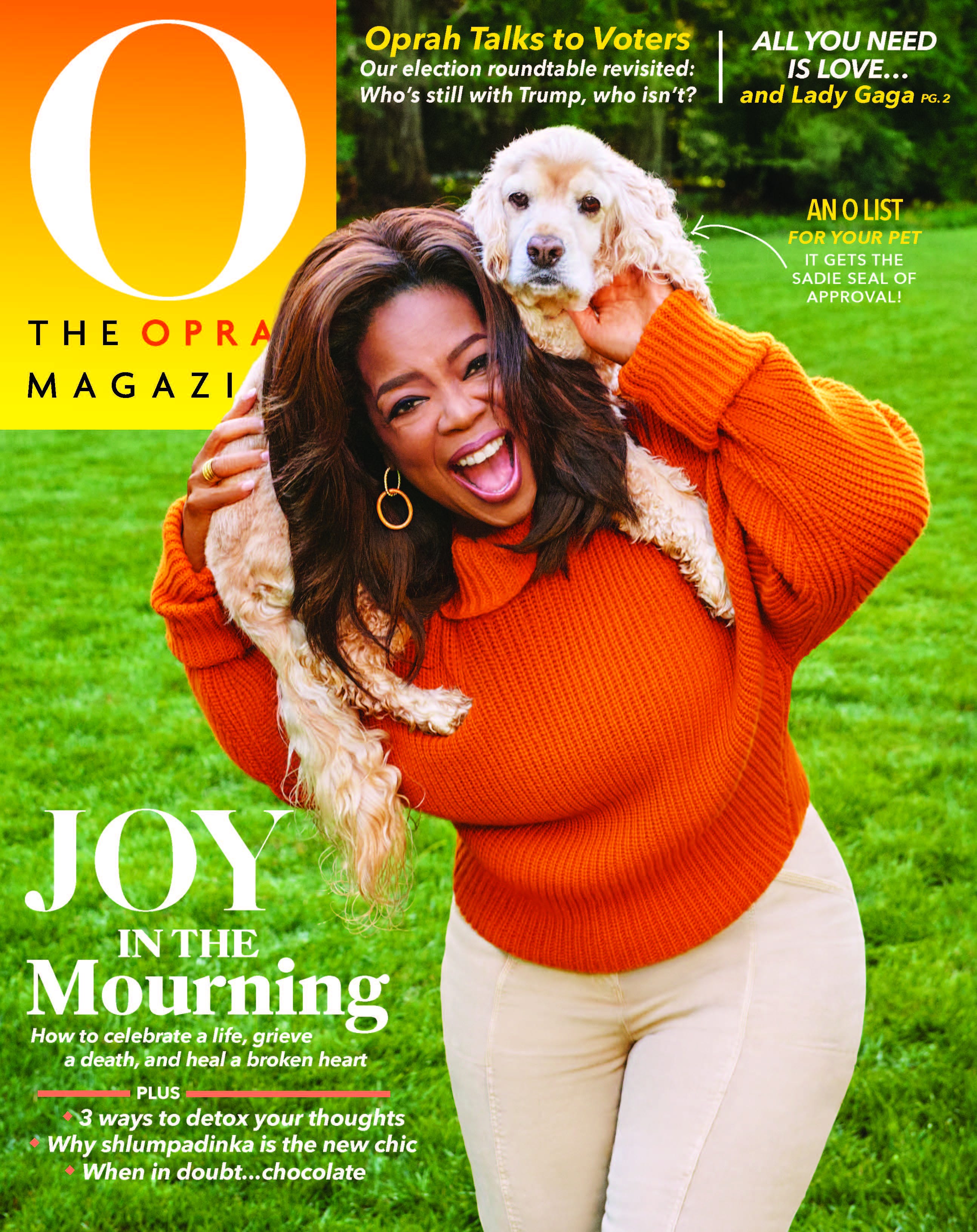
Oprah Magazine reminded me of joy and happiness. The orange sweater she was wearing demonstrates fall and the Halloween season. Bright colors are very happy color. She was holding her dog and that made the whole magazine very sweet and soft. It brings love and happiness. Inside magazine was more feminist looking.
Southern Living includes various of recipes that are mostly based on the south. The magazine was very red more of a maroon color. They were targeting audience on what living in the south is like. They were also trying to lure in consumers that will follow the recipes.
Comments
Post a Comment